|
INTRODUCING THE COLLECTION: A BRIEF HISTORY OF NINETEENTH CENTURY MUSIC TITLES In his authoritative catalogue of French graphic arts in the nineteenth century, written as that century was about to close, Henri Béraldi, confessed to selectivity in his coverage of lithographic music titles, which had been one of the areas of most prolific production in his chosen field. "In our iconography of the nineteenth century", he admitted, "we have not omitted the music title, because, if need be, it might in itself furnish a history of lithography, but to all things there are limits, and there is no more reason to encumber catalogues with these titles, than there is reason to encumber print collections with them. It is up to the enthusiast to make his own discriminating choice amidst the immensity of production". He practised what he preached in including only a cut-down representation of them. Béraldi revealed himself a convert to art critical realism in taking on board some of the graphic art which, in his time, had been produced "as an auxiliary of commerce, of industry and advertising, in the conditions which modern life sets for it" , but, despite his suggestion that such things might be worthy of study, his disclaimer does seem to consign the music title to some sort of limbo, where it has to a great extent remained, admittedly, from the point of view of market value, greatly to the advantage of those discriminating enthusiasts.
The early years of the twentieth century saw two very different publications appear on the subject. On the one hand, John Grand-Carteret's rather august survey of illustrated music from the sixteenth century to the romantic era, Les titres illustrés et l'image au service de la musique (Turin, 1904), which avoids dirtying its hands with the more commercial and popular product of recent times, and, on the other, the extraordinary collector's manual written by a man who was himself a writer of songs for the halls and therefore close to the popular end of the music business: Illustrated Music Titles and their Delineators by W.E. Imeson (London, 1912). As far as the English music title is concerned, Imeson's book must remain the gospel. He knew some of the delineators in person and of others he was able to record reminiscences by surviving colleagues.
Alois Senefelder, who invented lithography in the final years of the eighteenth century, was not alone in realising its use as a means of printing musical notation. From its inception, the medium enjoyed close associations with the world of music. At one moment in his early life, the composer Carl Maria von Weber even learned the technique so that he could print his own work. Artistic experiments were conducted using it in the first decade of the new century in Germany, France and England, and its potential as a creative medium was more fully realised by Géricault between 1817 and his early death in 1824, and then with greater freedom by Goya in the four bull-fight plates which he produced in Bordeaux in 1824/25. Writers on the subject have located the first use of lithography for music titles immediately after the end of the Napoleonic Wars, in 1815. The earliest datable example in this collection is from 1824, but the vignette illustrating Bétourné and Labarre's La fuite du contrebandier, the only essay of this sort by the painter, Eugène Delacroix, follows not far behind, and has been dated to 1826. Depicting a Spanish smuggler fleeing into the mountains, this might perhaps have seemed to Delacroix a lowly use of his talent, but several of his more noted contemporaries, among them Denis Raffet, Horace Vernet and Achille Deveria were persuaded to provide vignettes for sheet music by the enterprising and ambitious music editor Schlesinger, who was to serve as one of the models of the shady art dealer, Arnoux, in Flaubert's L'éducation sentimentale.
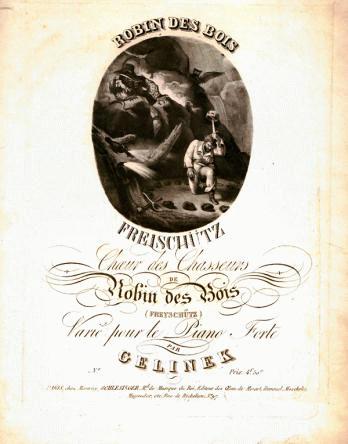
Anon. "Robin des Bois", (a piano piece based on music from Weber's Der Freischutz), published by Maurice Schlesinger in 1824 Schlesinger's covers elegantly combine lithographic vignettes with finely proportioned and beautifully spaced lettering.
The bright colour and integrated design of French posters around 1900 are not anticipated in French music titles in the earlier years of the nineteenth century. In fact, one of the chief influences on the development of these posters seems to have been the English music title, the point of contact being the residence in London between 1856 and 1866 of the graphic artist, Jules Chéret, who is generally credited with instigating the movement. In the preceding period the bulk of French titles are in monochrome, with superimposed typeset lettering . Posters produced in France before 1866 make only occasional and crude excursions into colour. The collection of music titles illustrated in this website was formed largely with the aim of throwing light on this particular instance of international cross-pollination, just one of so many in the fine and decorative arts between the two countries over the course of the nineteenth century, when political upheavals, and the economic fluctuations resulting from them, led to frequent movement of French artists over the channel and back.
But, if the collection seems to make a case for positive British influence on the art of France, it also illustrates the strength of the French school of music illustrators working in monochrome lithography. The chief of the French music title artists was undoubtedly Célestin Nanteuil, generally portrayed as a romantic wunderkind, who, after a decade or so of intense, quirky and precocious evocation of the historical dramas of Hugo, Dumas and de Vigny, settled for a more reliable career as a provider of sentimental ballad illustrations and derivative paintings. The quality of the Nanteuil titles in this collection, will, it is hoped, make clear that his artistic decline was less total than those accounts suggest. If only in the technical manipulation of the medium, Nanteuil sustained a high level of quality in his lithographic work. He could even call on the associative capacity of the viewer to bring colour, imaginatively, to a black and white image, as in L'arbre de Noël, where the dun tint of a snow-filled sky can be intuited behind the imagined blues and reds of a suspended image of the adoration of the Magi. The collection contains only one of the much lauded early pen and ink lithographs executed by Nanteuil in the 1830s. This is on the cover of Gustave Carulli's Four Vocal Quartets, a typical Nanteuil frontispiece, full of goat-faced men and moon-faced women, framed by twirling plant-forms.
Even the Carulli cover can only be dated to the thirties on grounds of style, since few of Nanteuil's music titles are dated in the literature. The art critic Champfleury started to make a list of them, but it was never completed. As far as it went, it is included in Béraldi's entry on Nanteuil in Les graveurs du XIXe siècle (vol.X, Paris, 1890). Several of the titles included in the collection are even absent from the extraordinarily long summary list of titles provided be Béraldi. As an illustrator Nanteuil could be vapid, but the persistence of the romantic strain in his work parallels that to be found in French opera and songwriting of the period. Interestingly, amongst his very last works is the poster for the book of Massenet's first full-length opera, Don César de Bazan, of 1872. Nanteuil was to die in the following year. With the exception of Nanteuil, and before new life was injected into this form by Chéret, Steinlen and Lautrec, French music titles after 1850 tend to be artistically undistinguished. Probably the most prolific of the French title artists of the later years of the century was Antonin-Marie Chatinière, described by Béraldi as the lithographer by appointment to musical editors, and dismissed by him in very few words. For Béraldi he was only remarkable for having designed posters for operatic works by Massenet, Saint-Saëns and Délibes, but we can add that he abused the privilege by producing images of a banality which might be described as sub-Bollywood.
By contrast, the English music title grows from modest beginnings, to become by the middle years of the century a playground for some extremely inventive talents, enabling members of the public to purchase, along with their parlour music, ambitious works of art in colour, rivalling the paintings on show at the Royal Academy, for the price of a few shillings. From being a product which was often, though not always, elegant and genteel, the music title benefited from the expansion and commercialisation of popular music through the music-halls, and, although the halls themselves may have bowed to commercial and patrician pressure in modifying the drunken rumbustiousness of their entertainments, the growth in celebrity of such perfomers as George Leybourne, Alfred Vance and Arthur Lloyd, created a viable market for lavishly produced sheet music of a popular type.
The artistic quality of Victorian music sheets, always evident to enthusiasts, has been presented in the sparse literature on the subject, as secondary to their value as documentary records of the life of the time: the international exhibitions, public transport, the postal service, the response to evolutionary theory, and above all the halls themselves, whose songs reflect the idiosyncracies of metropolitan life at all levels of society. However, viewed as an artistic type, the music title has its own self-conscious morphology. W.E. Imeson's early book on the subject reveals an artistic micro-culture, which, whilst it does connect at points with the world of illustrated periodicals such as Punch and Illustrated Sporting and Dramatic News, has its own succession of leading artists and its own technical and aesthetic objectives. The occasional appearance of famous paintings from the Royal Academy or the Paris Salon on the covers of sheet music, does not diminish the impression that the producers of the customised product belonged, in relation to the world of respectable fine art, to a parallel and somewhat insular world.
Engraved vignettes for music have a long history in Britain, but the pioneer of British lithographic titles was Maxim Gauci, a Maltese artist, , born in Rome, who is said to have achieved some reputation as a miniaturist in Paris, before coming to England, according to Imeson's acount, "a few years prior to Waterloo". This "father of music title artists", as Imeson would have us see him, is in fact better known in some circles as a faithful and laborious transcriber of botanical drawings and paintings onto lithographic stone, for publication in natural historical publications. He was also a prolific portrait lithographer, generally working after other artists' originals. However, it does seem to have been in the field of music illustration that Gauci got his chance to show his own imaginative bent. His talent was an aimiable but not a great one. He specialised in silvery grey toned vignettes and shared a partiality with many of his contemporaries for sentimental Swiss and Italian bucolic subjects. Many of his weakly drawn but appealing illustrations ornament music popularised by the singer and actress Mme. Vestris, who, as the granddaughter of the engraver Francesco Bartolozzi, probably knew the publicity value for a performing artist of such images.
Gauci retired from the music title business in about 1840, just before colour began to be used in music titles.
Gaucis successor as the leading music illustrator of his day, John Brandard, found his name similarly linked with one particular musical performer. Working in a life-long partnership with the lithographic printers M. and N. Hanhart, Brandard produced many of his finest titles for the polkas and quadrilles of the conductor, composer and concert promoter, Louis-Antoine Jullien, from 1844 until 1856, when Jullien was ruined following the Covent Garden fire, which destroyed his entire stock of music. Recently described as the Jean-Michel Jarre of his day, the extravagantly waist-coated Jullien was the inventor of the promenade concert, and did his utmost to give his performances visual apeal. Brandard's music covers were but one aspect of a wide-ranging visual charm initiative. Brandard took the chromolithograph, which had been first used in connection with music in 1841, to an incredibly high level of sophistication, using half a dozen or more stones to produce a single image, printed on paper of a far higher quality than had been used for this purpose hitherto. Stylistically, Brandard belongs to the light romantic school of illustration, associated above all with the watercolourist Alfred Edward Chalon and with the magazine The Keepsake. The colours red and blue predominate in his palette of the 1840s, along with some exquisitely diaphanous draughtsmanship and plentiful use of gold, especially in filigree borders. This latter was something Brandard may have learned when copying medieval illuminations for the Hanharts' bound music albums. His covers convey an illusion of luxury and refinement, and are clearly aimed at the wealthier sections of society, the figures of the young Queen Victoria and Prince Albert appearing occasionally to bestow a "by appointment" air.
The elegant world depicted by Brandard in the 1840s, reminiscent at times of the preposterously arch Mantalinis in Dickenss novel, Nicholas Nickleby, faded somewhat from view in the following decade. The 1850s saw the Great Exhibition and, then, with the Crimean War and the Indian Mutiny, the first involvement of Britain in major overseas conflict since Waterloo. All this is reflected in the song sheet, not only in subjects directly relating to the events, but probably also in more down to earth imagery. The pictorial style changes too, becoming generally more scenically ambitious, banishing lingering hints of the vignette, and filling the rectangular circular or oval field with a fully realised picture, as for instance in the landscape work of Thomas Packer, whose subtly coloured evocations of scenery earned him in the trade the title of "the graduated tint packer". Towards the end of the decade, two important new figures transform the scene.
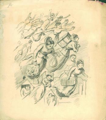
R. J. Hamerton, "Housemaids Flying Above Rooftops", (Pencil drawing)
One is Robert Jacob Hamerton, who had earlier worked as a cartoonist for Punch, and who would in the next decade involve lettering and figures in riotous combinations, the other the generally accepted past master of the English music title, Alfred Concanen.
Imeson gives a graphic description of Alfred Concanen, or "Con" as he was known to his friends. "Though a man of rather slight build", with "a blond moustache of a cut and dimensions calculated to arouse the envy of the heaviest of heavy dragoons", he he formed part of "a trio of moustachios (followed of course by their respective owners), which frequently paraded Fleet Street and created no little sensation (for their owners walked arm in arm) " especially amongst the fair sex". There is probably a reminiscence of this trio in the heavy swell and companions who make their appearance on Concanen's cover for the Jolly Dogs Polka of 1865. His family were originally from Galway in Ireland, hence, perhaps, the very convincing colouring of the Irish landscape on the cover for Has Sorrow Thy Young Days Shaded. Ireland"s connection with the theatre in Victorian England was strong, in the early years with the operatic composer, Michael William Balfe, the actor Tyrone Power , and the playwright Dion Boucicault. Later, of course, came Wilde and Shaw. Concanen may be claimed as part of what Shaw described as the Irish Conquest of Victorian London, and for him the theatrical element was predominantly, though not exclusively the world of the music hall. Opera, comic-opera and the pantomimes at the Drury Lane Theatre were equally grist to his mill.
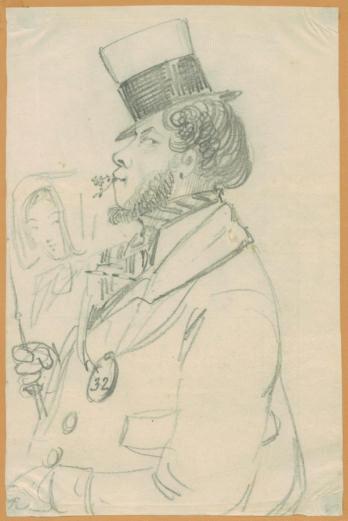
A. Concanen, "Ogling Cabbie", (Pencil drawing) What distinguishes his work, started in earnest, we are told, in 1858, the year of his marriage, is a generous and easy drawing style, at times inclining to melodramatic emphasis in the treatment of the figure, at others to caricature, but which encompasses a great deal of plausible detail relating to contemporary London life, including sympathetic portrayals of the stars of the day, the so-called lions comiques of the halls. Occasionally for the features of these stars, it can be seen that Concanen worked closely from photographs, scarcely disguising the fact, but inserting the somewhat mechanistically rendered facial image into the more freely drawn costume or setting, resulting in images amusingly reminiscent of those seaside booths where you pop your head through a hole in a painted board, to get your picture taken in a sailor suit or some other kind of fancy dress. And, above all, Concanen had a stupendous sense of colour, clear and unblended, without any of the fake oil painting effects too often resembling vegetable soup, to be found in much mid-century chromolithography. In his own more limited sphere, one could say that Concanen did for lithography what Manet did for oil painting and at the same time, which may or may not have been simply serendipitous. Certainly Manet seems to have been introduced to lithography through two commissions for music titles, Lola de Valence and Plainte Moresque, both of 1862, and he was one of the few painter lithographers of his day to attempt polychrome lithography in his Polichinelle (1876).
In addition to Concanen's "picture" and "portrait" titles, there are the novelty titles which he produced, often in association with his partner, Thomas Wales Lee. Lee's figure drawing was less than assured, but he was known in the profession as "fancy title Lee", and as "the only man amongst us who can make letters speak". Some of these fancy titles attempt a kind of synaesthesia, with jiggering figures, eccentric lettering and vivid colours, creating in visual form an equivalent of excitable orchestral or band music. Others, setting the tone for the opening sequences of Monty Python, indulge in quirky, juxtapositions of figures with inanimate objects, shadow play, and various other virtually surreal caprices.
These were developments which the French artist, Jules Chéret, would have watched, after he came to London in 1856, especially since the production of music titles, chiefly for the music editors Cramer & Co. was to become one of his main forms of employment in this country. On his first visit, he worked as a draughtsman for the Maple Furniture Company, creating images for the firm's catalogue, returning briefly to Paris, where, in 1858, he succeeded in selling to the composer Jacques Offenbach a design for a poster for Orpheus in the Underworld. Béraldi gives a long, though incomplete list of the titles which Chéret produced after he returned here, roughly speaking in the period 1860-1866.
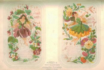
J. Cheret, "Floral Valentine Cards" from the magazine "Nature and Art". During this period he also designed scented advertising almanacks and Valentine cards for the parfumier, Eugène Rimmel. Already here, and active as a music title designer since 1850, was another Frenchman, Alexandre Laby, and the images of the prolific but insipid Antonin-Marie Chatinière were also frequently adopted in the 1880s by English music publishers. These French artists were exploited for the delicate sentimentality of their work. They were certainly not to the fore in the more comedic reaches of the trade. Béraldi claimed that he listed Chéret's English music titles "simply as curiosities", since they in no way resembled, in his opinion, the later work, Chéret not having yet found his style, and in saying this, Béraldi would have been reporting indirectly the artist's own opinion of his early efforts. One reason for the discrepancy was presumably the confinement within his supposed area of expertise of Chéret as a Frenchman. Humour is in general the first victim of internationalism. Furthermore, it was only in the last year or two of his stay, that Chéret's English titles went into colour. His drawing style is at this stage rather nervous and angular. And yet, a title like The Witches' Own Galop, despite the apparently satanic and romantic nature of the subject, which links it to similar productions by Célestin Nanteuil, is obviously not entirely serious, with its seemingly endless formation of witches on broomsticks riding moonwards beneath the outspread wings of an immense owl. In it one already feels that some of the humour of his English colleagues has brushed off on him. And here he already uses what at this stage seems to have been his favourite type of comic lettering, one imitating rustic woodcraft, the main features of the letters grooved like tree bark, and with spiky thorn or rootlike developments standing in for serifs, an exaggerated version of the comic lettering he had already used in his Orpheus poster.
The novelist and art critic J.-K. Huysmans found in Chéret's posters of the 1870s and 1880s a "demented almost explosive joy". His admiration for them inspired a comment which must have been at the back of Oscar Wilde's mind when he coined his deathbed quip, referring to the decoration of his Dieppe hotel room: "My wallpaper and I are fighting a duel to the death. One or the other of us has to go". For Huysmans the choice was between the posters and the new Paris streets, with their "flat and dismal buildings, whose apect exuded atrocious boredom". Chéret or the streets, he decided, "one or other of them, in present circumstances, has no right to exist". The explosive joy and "torrential gaiety" of Chéret's images may well have been a product of his English sojourn. While there, he had provided what at that time the English had seemed to expect of a French graphic artist, but back at home he could import some of the excitement of English music illustration to the French metropolis, though, as time went by, he was increasingly to douse it, or perhaps one should say smarten it up, with reminiscences of French eighteeenth century drawing.
By comparison with his posters, Chérets later music titles are artistically unambitious and rather unexciting. The same is not true, however, of Lautrec. Whereas, in England, with the death of Concanen in 1886, one can say that the creative phase of the lithographic music title was over, in France, though the titles remained predominantly monochrome, the years around 1900 saw a surge of activity in this area. My collection gives some indication of this, but missing are the numerous illustrations which Lautrec provided for the covers of songs by the intrumentalist and composer Désiré Dihau. They show Lautrecs drawing at its freest, and sustain our interest long after his more in-your-face poster images of famous cabaret figures have palled from over-exposure in art books and on aprons and tea-mugs.
Sources:
Henri Béraldi - Les graveurs du XIXe siècle, 12 vols, Paris, 1885-1892.
Lucy Broido - The Posters of Jules Chéret, New York, 1980.
Adrian Gőtz - Toulouse Lautrec: The Complete Graphic Works, London, 1988.
John Grand-Carteret - Les titres illustrés et l'image au service de la musique, Turin, 1904.
Jean C. Harris - Edouard Manet Graphic Works, New York, 1970.
W.E. Imeson - Illustrated Music Titles and Their Delineators,. A Handbook for Collectors, London, 1912.
Aristide Marie - Célestin Nanteuil, peintre, aquafortiste et lithographe 1813-1873, Paris, 1924.
Roland Pearsall - Victorian Sheet Music Covers, Newton Abbot, 1972.
Doreen and Sidney Spellman - Victorian Music Covers, (with an introduction by Sacheverell Sitwell), London, 1969.
Links: A web site featuring a collection of American sheet music titles is here.
|
|


